
Reference
Image
Image; alt is required for accessibility (rule A01). Given an image the program declares, it becomes a <picture> with every width the build wrote.
Image(_ source: Picture or String, src: String, sizes: String, placeholder: Enum, …)
Before 5.0
src
sizes
placeholder
blur
color
none
alt

Pictures from public/ are resized to WebP at every width a page asks for.
Example
Stack(gap: .md) {
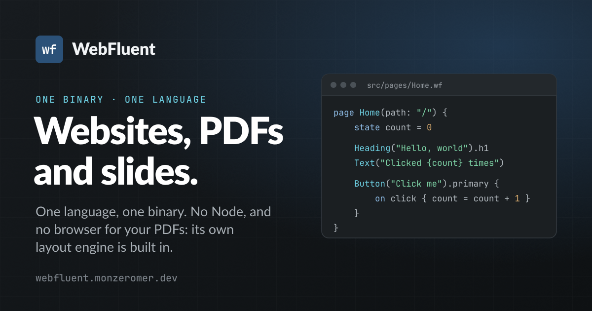
    Image(src: "/og.png", alt: "WebFluent's sharing card: the name over a dark field",
          sizes: "(max-width: 768px) 100vw, 640px", placeholder: .blur).rounded
    Row(gap: .md, align: .center) {
        Image(src: "/icon-512.png", alt: "The app icon", width: 64, height: 64).circle
        Text("Pictures from public/ are resized to WebP at every width a page asks for.").muted.sm
    }
}
Decorative: an empty alt, so a screen reader skips it
Image(src: "/icon-512.png", alt: "", width: 32, height: 32)
The average colour while it loads, and loaded at once
Image(src: "/og.png", alt: "The sharing card", placeholder: .color, loading: .eager)
From an address elsewhere: used as written
Image(src: "https://example.com/team.jpg", alt: "The team at the launch", width: 1200, height: 630).lazy
Props
| Prop | Type | Unset | Meaning |
|---|---|---|---|
source | Picture or String (positional) | none | An |
src: | String | none | The picture's address. A literal path of |
sizes: | String | none: the browser assumes the full window width | How wide it will be shown, so the browser picks one of the widths the build wrote: |
placeholder: | one of its cases |
| What fills the box of a processed picture while it loads, cleared when it lands. Written as a flag,
|
alt: | String | none ( | Text alternative; |
width: | Number | none | The |
height: | Number | none | The |
loading: | one of its cases | the page's first image | When the browser fetches it. Written as a flag,
|
shape: | one of its cases | none: square corners | Its corners. Written as a flag,
|
Attribute families: global, aria, data. Plus the 22 universal props every element takes: animate:, exit:, speed:, duration:, delay:, easing:, stagger:, on:, count:, shared:, class:, ref:, drag:, dragGroup:, dropValue:, dropAxis:, dropInside:, roving:, trapFocus:, mount:, update:, cleanup:.
Flags and cases
A flag is written after the parentheses with a dot: a Bool prop, or a case of one of the element's enum props. A case the enum lacks is an error with a hint.
.blur
.color
.none
.lazy
.eager
.rounded
.circle
Events
The DOM events it is drawn to answer. Any other DOM event works too, in an on … { } handler.
| Event | Sends | Meaning |
|---|---|---|
on load | DOM | An image, video or frame finished loading |
on error | DOM | An image, video or script failed to load |
Every element also takes the props, the events and the attribute families listed on every element.
Slots
It takes no slots.
Renders with the class wf-image, stable across releases, so a stylesheet may target it.